When I first wrote the word “downstairs” in this post, it reminded me of “Upstairs, Downstairs” and how that distinguished between the homeowners and the servants.
We do not have servants living in this downstairs. This is just a regular old 1980s downstairs. I guess there IS what they deemed a 4th bedroom downstairs, so I guess technically we could have someone living there, but really…it’s not the same.
With that clarification over, let’s begin. I’ll try to make this tour as snappy as possible, and in return, please forgive my imperfect photos. They were all taken on inspection day, while the prior owners were still living there.
Sidenote: Honestly, I was just snapping away on photos and feeling overwhelmed when we were going through the purchase of this house. I’d just had a baby five months prior, and the whole house purchase was unexpected in its timing. The house was also almost twice as large as we had been shopping for (it was just in such bad shape that it happened to come down into our price range and Matt spotted it pop up and went to take a look). Probably 4x as large as the last flat we’d lived in in New Zealand.
It’s a cool story how we ended up with this house (SO many unexpected twists and turns!), but I’ll have to tell that one later. I’m supposed to be giving a tour right now.
THE ENTRY
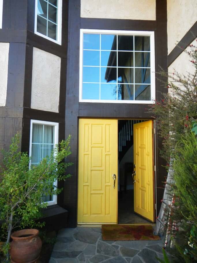
If you walk in this bright yellow door…
…you’ll find yourself here in the entryway.
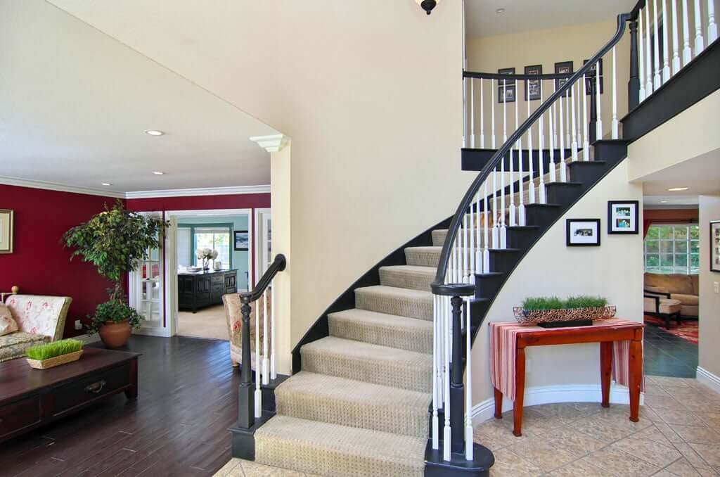
Doesn’t look too bad, right? Looks nice. No one can tell from this picture that the house needs a completely new HVAC system, a new roof, and that the attic had some kind of hole in it and got infested/messy by birds, also destroying all insulation up there in the process…just to name three off the top of my head.
PS: And that bird situation has to get taken care of because Jess has A THING about birds.
No, you can’t tell that from these photos.
But this house has sat on the market for a looooooong time, and I suspect one of the reasons is that the prior owners did very little maintenance over the 10 years they lived there.
And you could only tell that when you were there on the spot. Up close. Getting the feeling somehow that this house is more of a fixer upper than meets the eye.
Now turn to the right with me and you’ll see this:
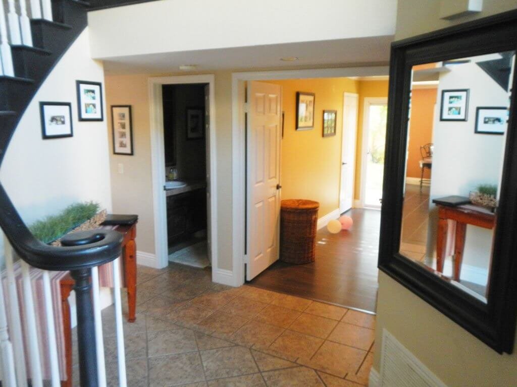
Now hang a sharp right and you’ll find yourself in the laundry room—which is also the gateway to the garage.
THE LAUNDRY ROOM (FOR NOW)
I’m not going to say a thing about this laundry room because you can read all my thoughts about ripping it out here—and see how it’s going to get totally changed.
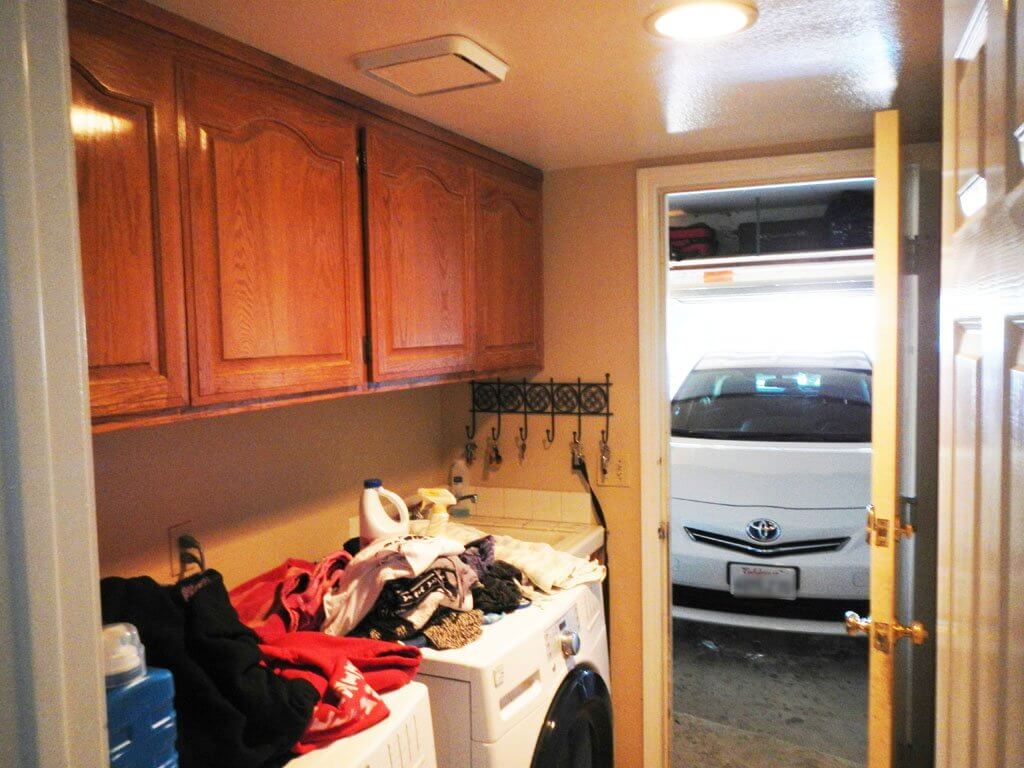
There are 11 doors opening into this one small space. 11. Some of them you can’t see in this pic, but they’re there.
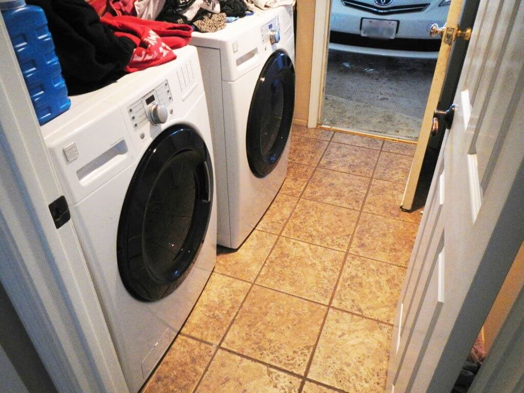
Back out of this laundry room (slowly, because it’s so tiny you might bump into me on this tour), and look to your left.
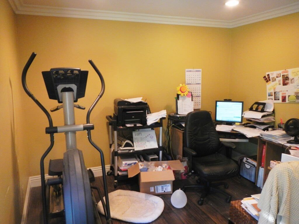
THE DOWNSTAIRS BEDROOM
Ignore the prior owner’s messy office and look outside with me instead:
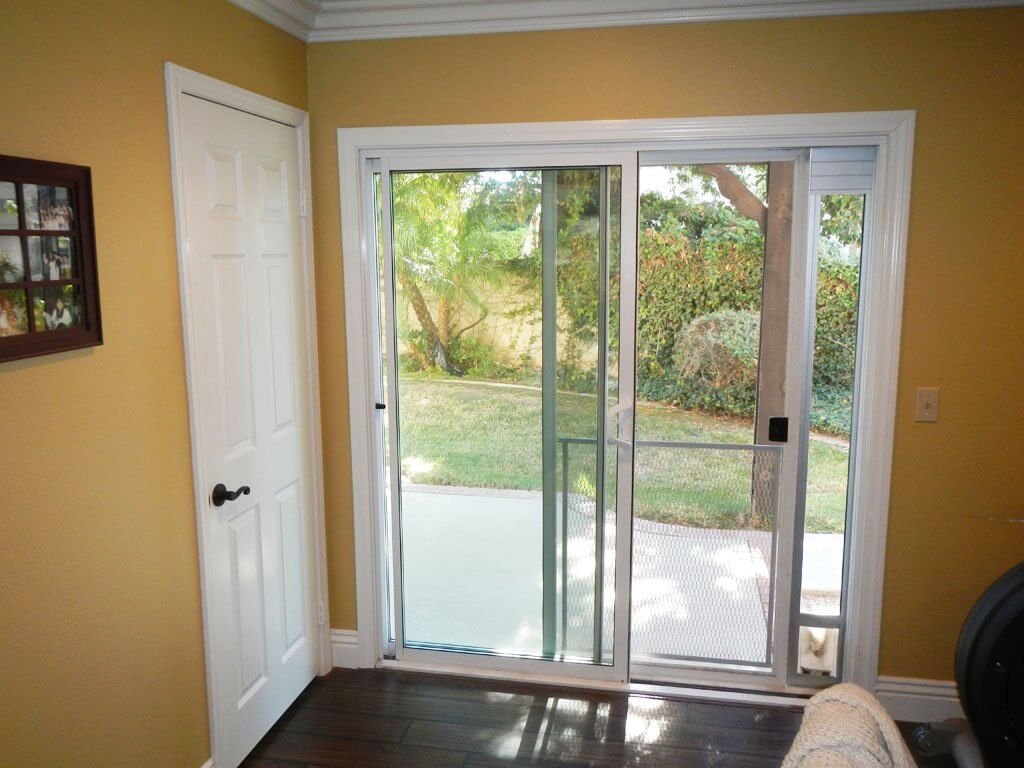
These sliding glass doors go to the side yard with a pergola over it. If we make this a guest room, guests could have their own private patio out there! (Can you see it? Visualize with me!)
Here’s looking back out to the entryway, to give you a sense of where you are:
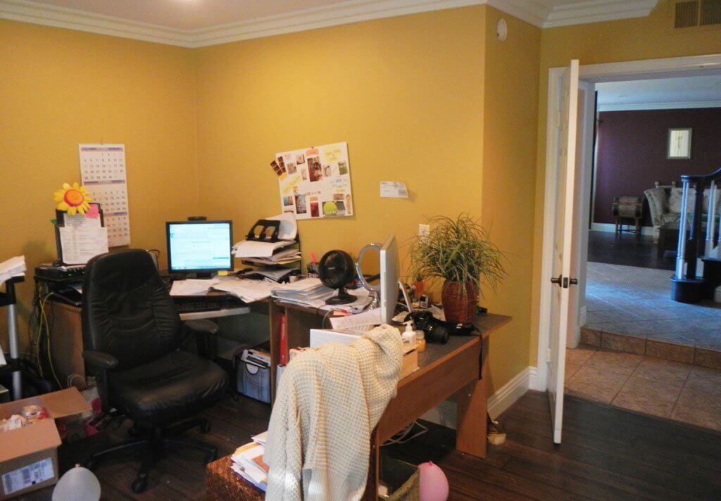
Now let’s go out the door and turn right.
THE DOWNSTAIRS BATH
Prepare for a whole lotta peachy pink.
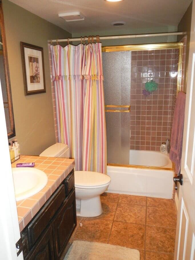
This is the full bathroom downstairs. Where our guests can apparently even take a bath if the mood strikes them.
(Although they’d better visit fast, because at this point I’m already planning ways to demo this bathtub situation.)
Continuing down this hallway, we’ll find ourselves coming into the family room (to the right) and the kitchen (to the left).
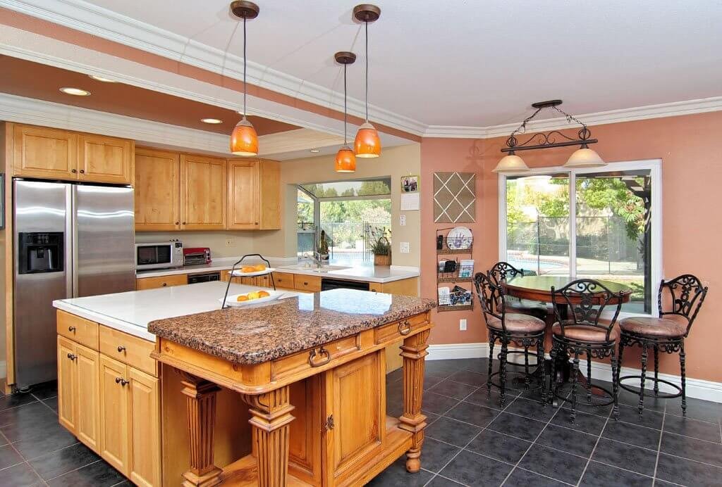
Just a quick shot of the kitchen before we turn to the family room, then we’ll get back to this kitchen. Fo’ sho’.
THE FAMILY ROOM
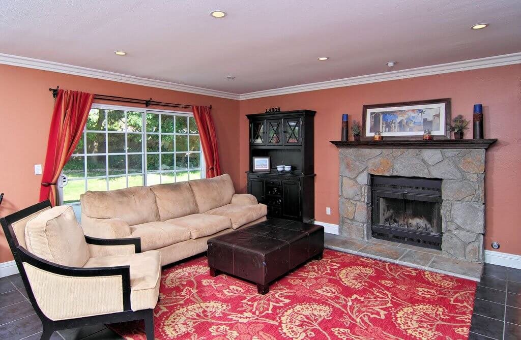
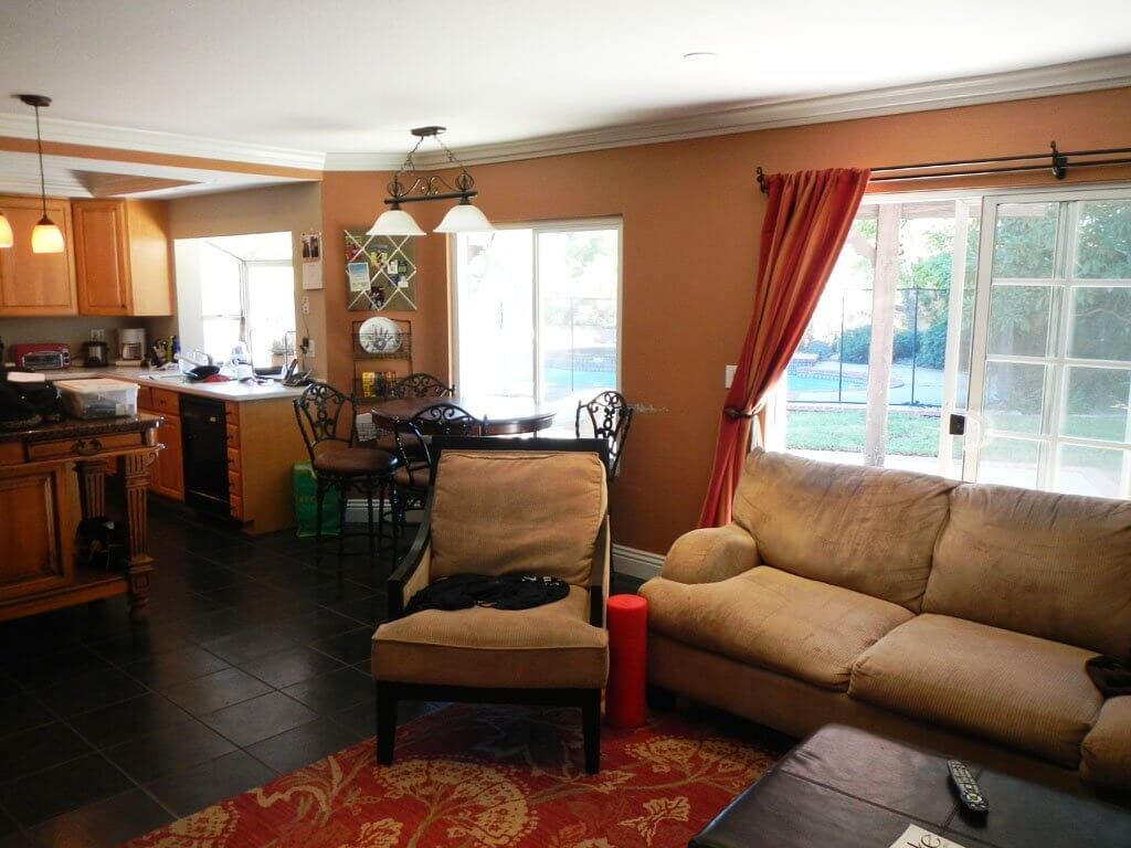
At this point, Matt and I were thinking this room needed (besides fresh paint) to be our dining room. After living in our first house, which had both a breakfast nook and a formal dining room that we rarely used, we were of the opinion that we only needed ONE dining area for our everyday and special use.
This was further confirmed after living in our three places in New Zealand, sometimes without a dining room at all.
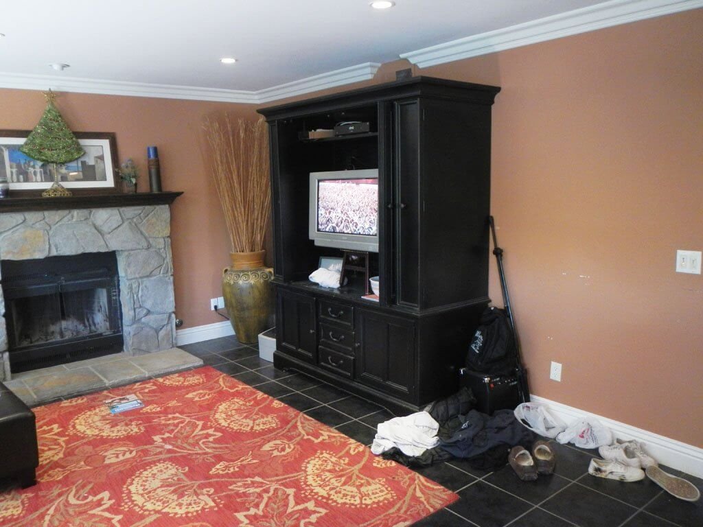
I thought it might be kinda fun to have a fireplace in our dining room, but mostly our reasons were functional: this is the only room that the kitchen opens up to.
And to us, it just makes sense that your dining room is the first accessible room from the kitchen, ya know?
This photo gives you a glimpse back down that hallway to the laundry room and garage entry door. (If you’ve read my first laundry room post, you’ll know my deepest, darkest feelings about that washer and dryer sticking out into the walkway. Take note.)
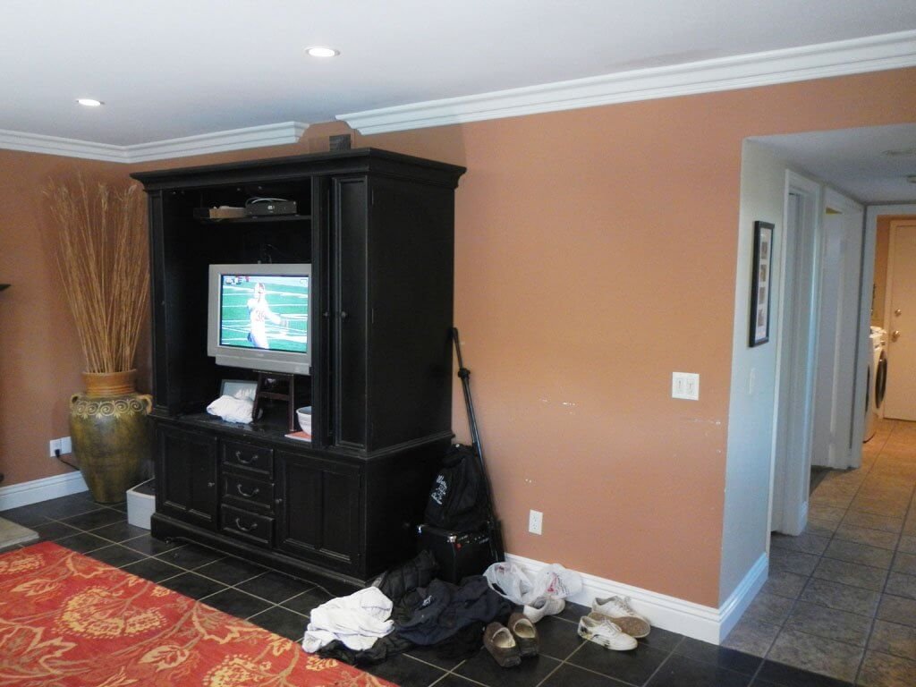
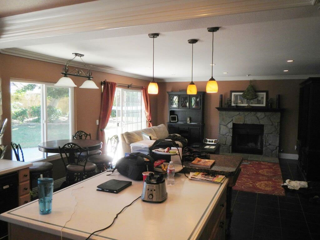
Here you can see how this “Fireplace Room” is the only room that really opens easily into the kitchen (everything else is through that narrow door back there to the left), and why we were thinking we wanted to make it the All-Time Dining Room instead.
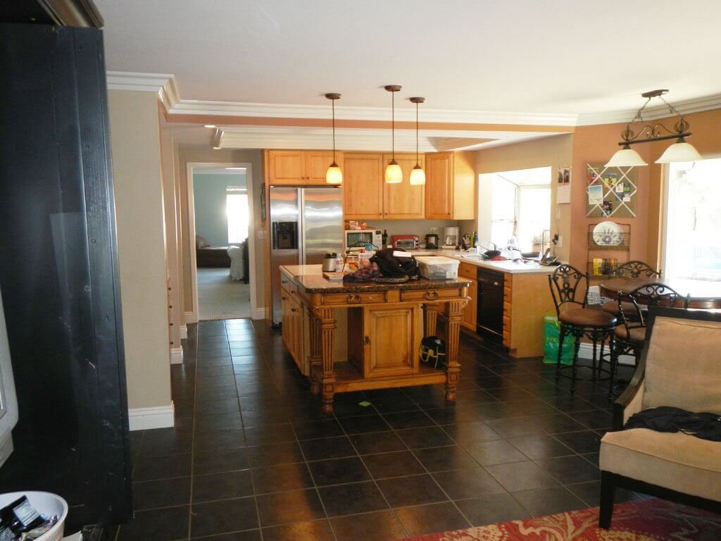
You can also catch a glimpse out to the backyard, with a peek at the pool back there:
THE KITCHEN
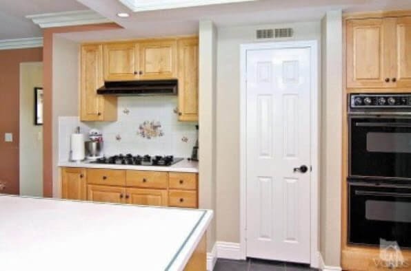
If you were warming yourself by our fireplace and turned around, this is your view to the kitchen.
That door leads to the pantry.
And yes, those double ovens are vintage 1980s.
Here’s where we announce that this kitchen was the #1 reason we almost DIDN’T put in an offer on this house. We didn’t like the layout, for starters, and I’m sure the rest’ll all come out in our “How We Bought This House” story later.
The cabinets weren’t bad. They seemed like a nice quality.
The counters were Corian, I believe, with a green decorative stripe around the edge. (Oh yes, I’m referring to them in the past tense, which tells you something.)
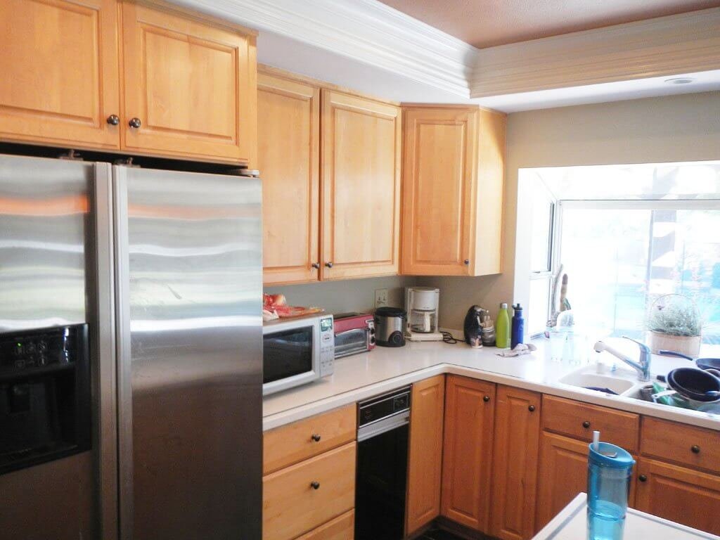
It IS nice having a kitchen window that looks out to your pool…
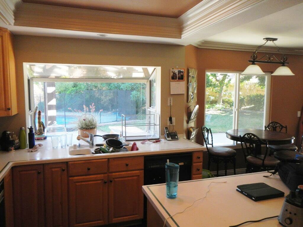
…but I’m sorry, I’m just so distracted by those low-hanging soffits. I think I asked Matt about 58 times, “How hard would it be to remove all THIS stuff [waving my hands in the general direction of the soffits, trying not to look directly at them ever again] coming down on the ceiling?”
His answer: “It’s not a small job.”
Thanks. Concise as always.
Doesn’t this man KNOW I need details (i.e. times in hours/days/weeks) by now? Sigh…apparently not.
(PS: I don’t blame him; I’ve since learned to ask more direct questions. I’ve become more fluent in Mattese in our 18 years together.)
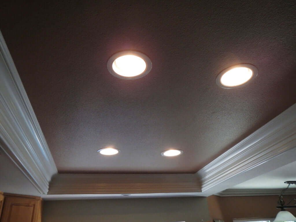
Matt is tall, and I am tall-ish, and we tall (and tall-ish) people do not like low ceilings. I especially do not like low ceilings because I clearly have claustrophobia issues.
I see low ceilings, and small undercurrents of panic start rolling through my chest. Just a little.
But funnily enough, when I see decorative tilework showcasing flowers and baskets of dainty berries, I do not feel even the tiniest bit of panic in my chest.
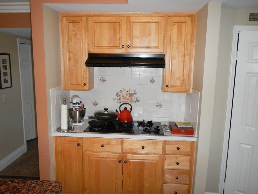
Instead, what I do feel is a good chuckle coming on. Because
- someone really thought that was pretty and I want to give them a friendly, gentle hug, and
- part of my chuckle is an evil genius laugh saying, “That tile won’t last long!”
(Although—spoiler alert—at this point we think we WILL have to live with it for a few years, because we want to get a feel for the kitchen before redoing anything. But oh no, little do we know that the kitchen renovation is coming much faster than we think…very unexpectedly…stay tuned…)
View from kitchen back to fireplace room:
THE GREAT ROOM
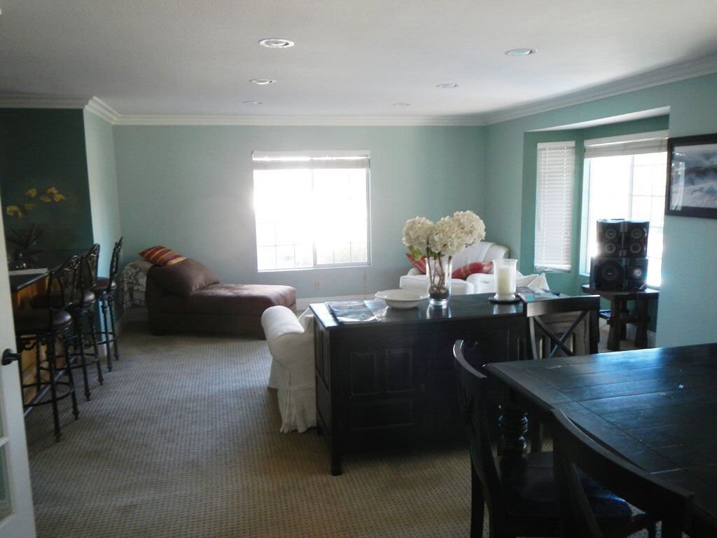
I’m not actually sure what to call this room, because most of it was an addition. This is the large room you find when you walk through that narrow door to the left of the fridge.
Originally, it was just a door to the dining room, then there was a wall to the left of the sliders you can see there. But two homeowners prior to us had built an addition, making the room much larger, plus a bar area:
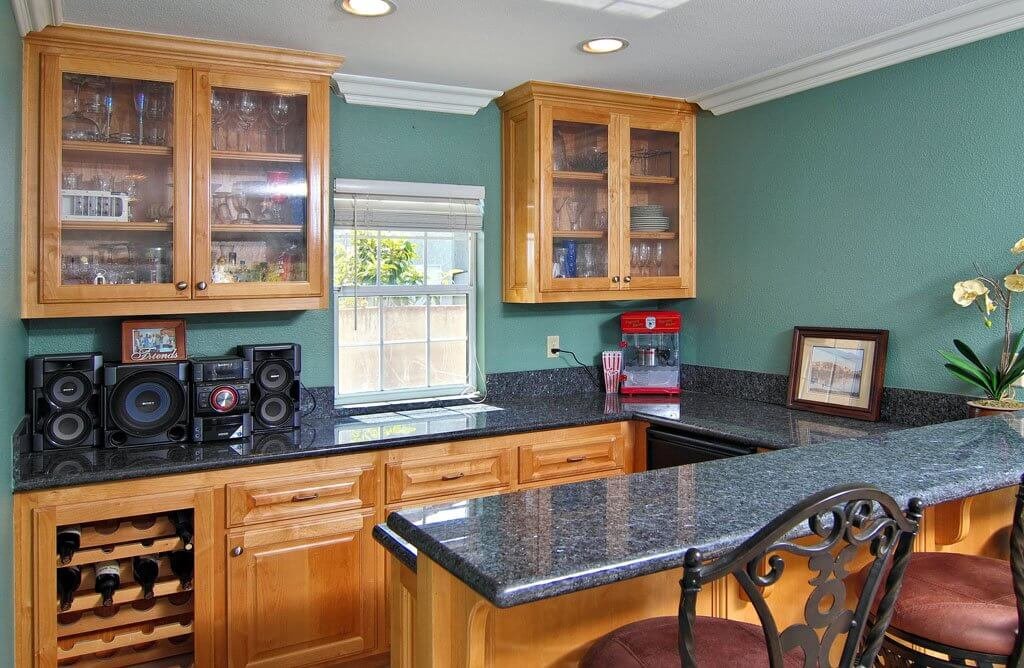
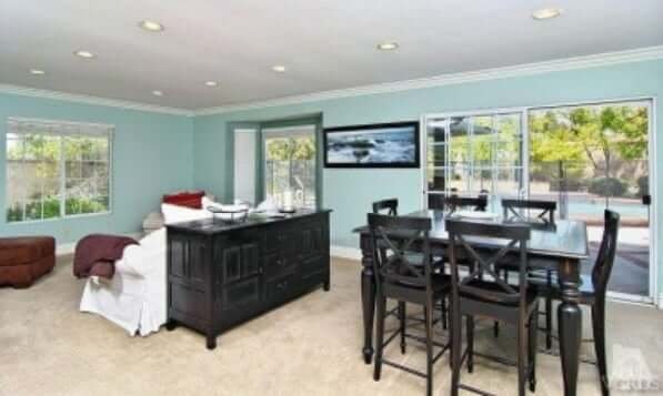
Let’s do a spin around the room, shall we? We can dance in here. Maybe we call this “The Ballroom” instead of the Great Room, since I wasn’t sure what to call it.
A ballroom with a bar.
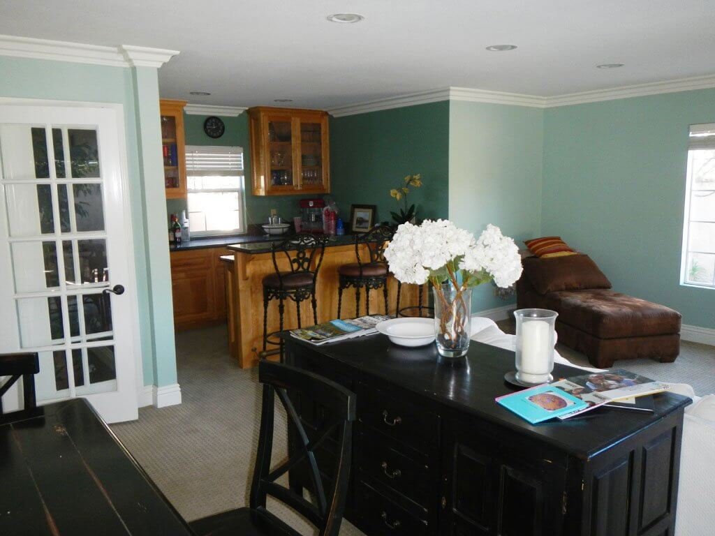
You can peek through that narrow door here and see into the kitchen and family/fireplace room.
Notice how I keep refusing to refer to that particular door as just a door, but it’s always “the narrow door”?
Yep.
Narrow = YOU ARE ON THE JESS RADAR.
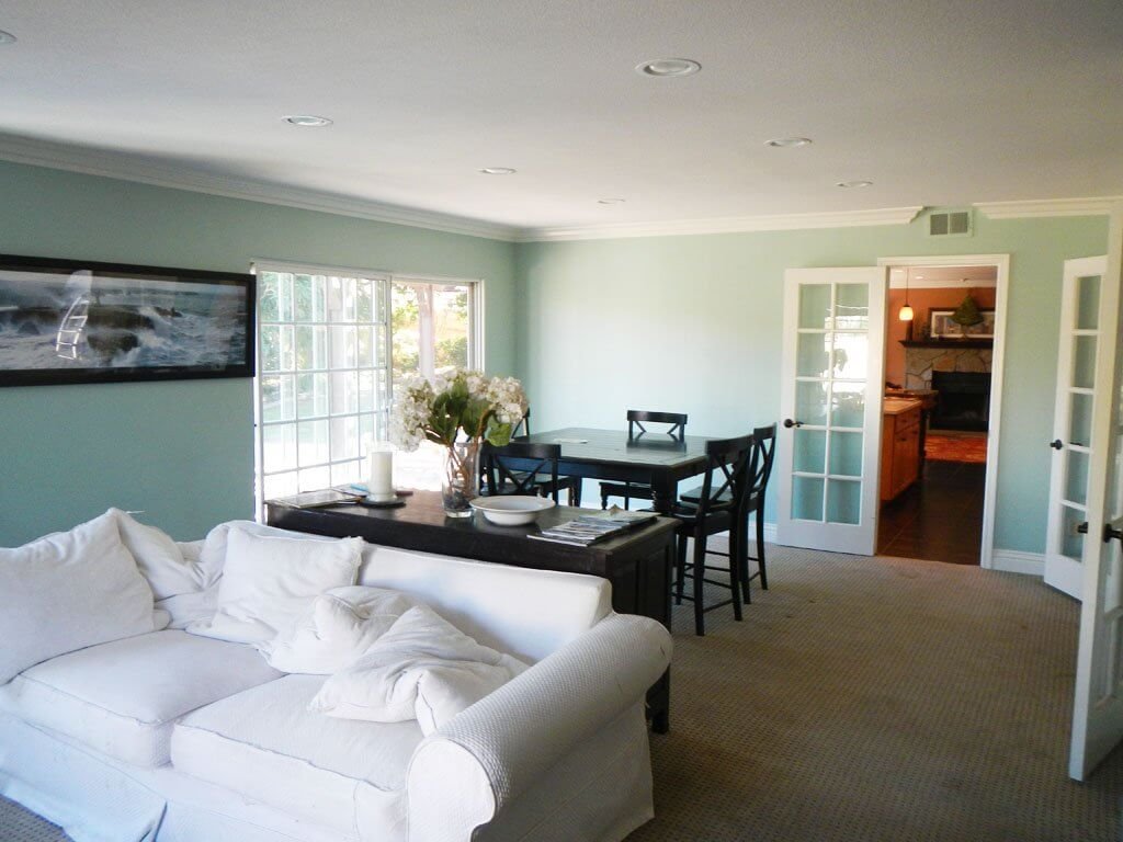
The double French doors on the right lead into the front “formal” living room and the entryway (you might be able to identify the stair rail in the distance to get your bearings).
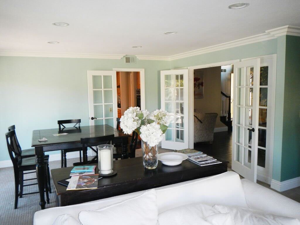
Their black table shows where the original formal dining room was before the addition/ballroom was built.
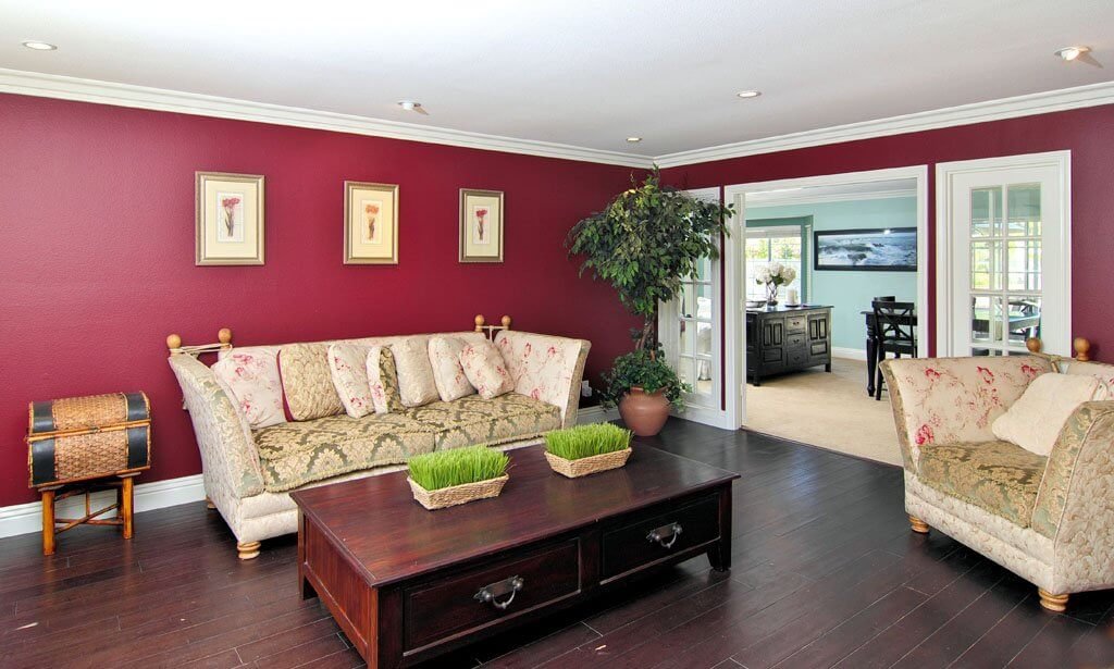
THE FORMAL LIVING ROOM
At this point, are you with us in thinking that this house has a LOT of “living areas” downstairs? Three, to be exact.
- The family room with the fireplace,
- the large addition area next to the bar, and
- This living room which is on your left when you walk in the front door.
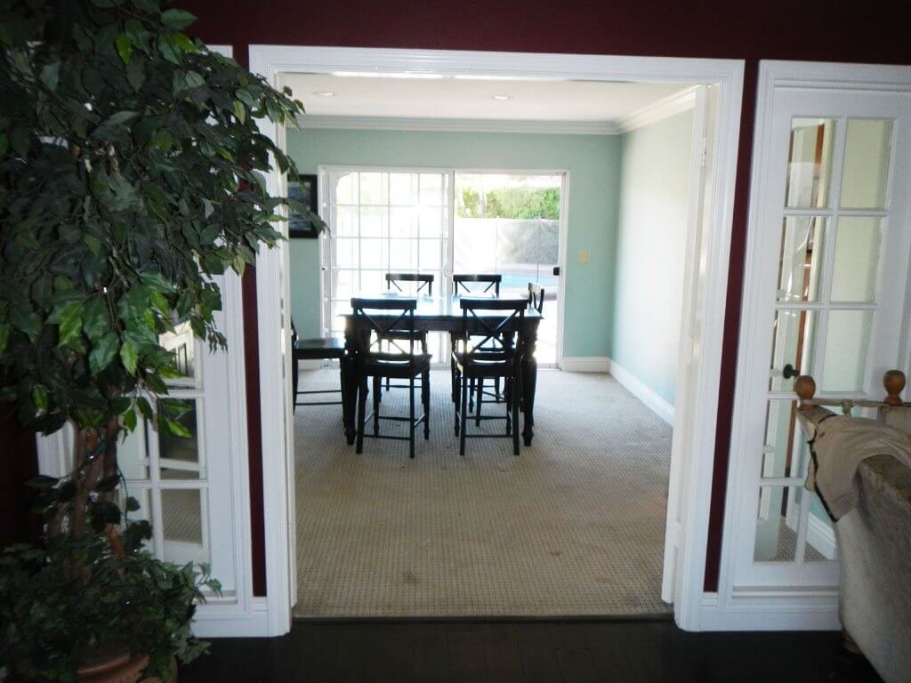
Here is your view back through the French doors to what used to be just the dining room, and where the old owners have their dining table as well.
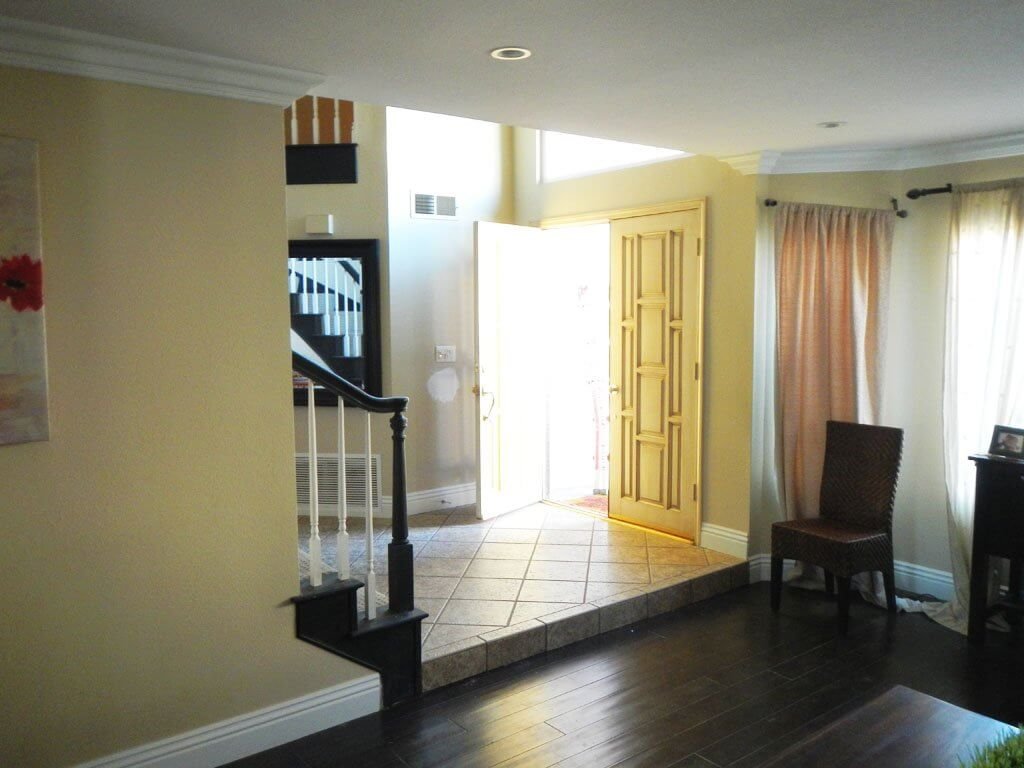
Well lookee there! We’re now back where we started in the entryway!
➜ Wanna come upstairs? I know you’re just itching to see all the surprises up there. Let’s go, yo!
➜ You can also tour our outdoor spaces if you need some fresh air (and want to see what really sold us on this house!).
➜ All house updates are on our current house page.
➜ You can grab our FREE interior design guide here!
➜ If you’d like our help RIGHT NOW be sure to check out our plans & design guides!





Pingback: 3 Faux-Real Simple Steps to a DIY Artificial Tree! – Sky Forbes