Do you know how to go about choosing interior colors for your home? Read on for 7 smart strategies to help you choose the perfect interior paint colors in your unique space for your unique needs!
Does it surprise you to hear that my dream kitchen in my dream house (in my dream world) is not white? 😉
Yes, I realize that because we made the decisions with THIS house to do
- all white walls
- a (mostly) white kitchen
- a white laundry room
- a white entryway (& mudroom)
- white linen cabinets
- white cabinets in our dry bar
- a (mostly) white bathroom, as well as
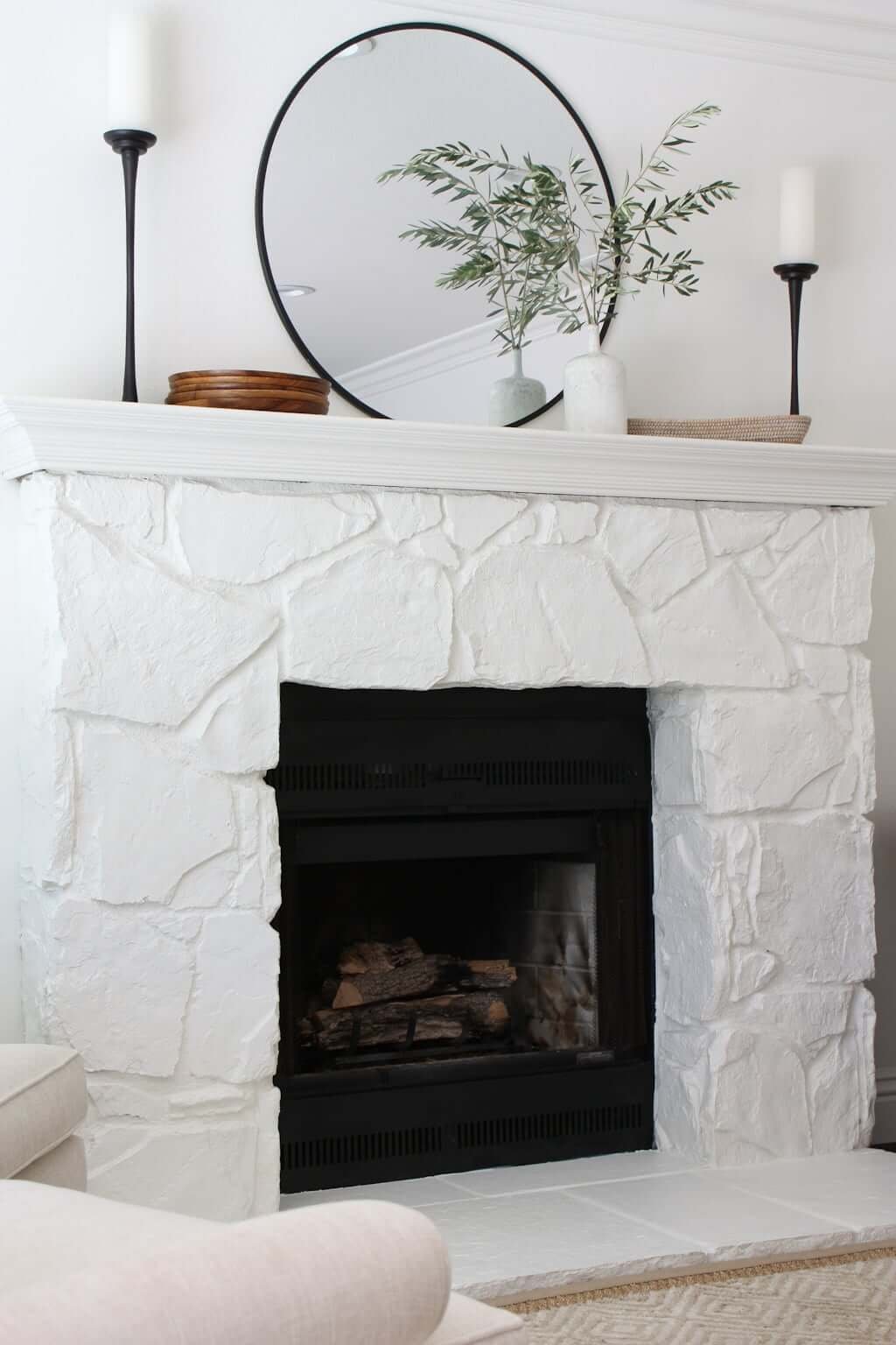
- paint our stone fireplace white and
- paint our brick fireplace white…
…some outsiders may think, “My goodness, this couple is white-paint happy!”
(I didn’t even mention the white we used on our house’s facade, because I’m just talking interiors today.)
Nope, we’re not white-paint happy.
But you know what we are?
Smart! 😉
I’ll show you why!👇
CHOOSING INTERIOR COLORS
Why We Went With White in the Areas We Did!
The reason isn’t that we’re so uncreative that we can’t think of any other color but white.
(Like when the time comes to choose a color at the paint store, Matt and I just look at each other like confused cavepeople and (scratching ourselves) say, “Duhhhhhh…we need a paint color? Oh! Uh oh. Uhhhhhh…white? Yeah, yeah, that’s easy…white! Let’s do white everything!”)
As much as I think life would be simpler sometimes if I just had the mind of a cavewoman 🤣, that is not my reality.
I am—if nothing else—indefatigably thoughtful. About everything.
Let me walk you through a simplified version of my process by which I arrived at “white” being the right answer for many painted areas in this particular house!
CHOOSING INTERIOR PAINT COLORS
The 7 Strategies!👇
#7: Look at your function & feel!
First, consider the function you want that room to have, as well as the “feel” you want in the space.
If you’re wanting to create a super-moody, cave-like feel in a den or bedroom, then a dark paint may be for you!
But if you’re looking to make your space feel lighter and airier (and maybe even a bit bigger!!!), going dark everywhere is probably not going to achieve that for you. (Unless of course you have a certain kind of house, but we’ll get into that later.)
CHOOSING INTERIOR PAINT COLORS
#6: Look at your space (including ceilings)!
How large is the room? And equally as (if not more) important,
how high are your ceilings?
For us, we have only 8′ ceilings throughout most of our home. (One downstairs hallway and the mudroom only has 7′ ceilings because of ducting that runs above them! Our bedroom is the one room with vaulted ceilings.)
PS: We did raise the ceiling HERE, so you can click to see if that’s feasible for you!
So for us, in this house, that meant things like
- ZERO soaring ceilings in our kitchen.
- ZERO soaring ceilings in our living room.
- ZERO soaring ceilings in our laundry room.
These 8′ ceilings mean, quite simply, less light. (Both less light coming in and less light able to bounce all over those room.)
➝ No extra high windows to let in more light.
➝ No extra wall space holding up those high ceilings to bounce around more light.
➝ A “tighter” feel all-around.
So for us, intentionally choosing white mudroom walls (as well as the white wood shelves and bench) help that space feel cohesive and as airy as possible even though it’s teensy weensy, has zero windows, with a ceiling Matt almost hits his head on!
CHOOSING INTERIOR PAINT COLORS
#5: Look at your floors!
What kind of floors do you have?
- Are they shiny? They’ll bounce more of your natural light in. Are they matte? Then they won’t.
- Are they light-colored floors? They’ll bounce more natural light around. Are they dark? Then they won’t.
Remember, dark colors tend to absorb light more visually than lighter colors. (See “The 25 Pros and Cons of Light vs Dark Hardwood Floors!”)
Ours are both matte and dark, and that’s a light-sucking combination if ever I saw one. So for us, white walls, white ceilings, and other light elements only help our space feel more spacious!
(Would we do dark hardwood floors again? See the answer here!)
PS: You’ll want to bookmark this to read next: The Only 25 Pros & Cons of Dark vs Light Hardwood Floors (The Ultimate List)!
CHOOSING INTERIOR PAINT COLORS
#4: Look at your layout!
You might be able to get away with dark features in your home if your small rooms open up to bigger ones. Maybe you have a low-ceilinged dining nook, for example—but it’s right off your 12′ (or 20′!) of soaring great room ceilings!
Then, that small area may very well be able to get away with dark colors because it’s not going to swallow up ALL that natural light it’s getting from that adjoining room.
Us? We have ZERO downstairs rooms with soaring ceilings. No rooms are “borrowing” light from any other rooms; they’re all in the same boat!
CHOOSING INTERIOR PAINT COLORS
#3: Look at your walls & windows!
How many solid stretches of wall vs windows make up the room?
I’ve seen several breakfast nook designs that are tight, low-ceilinged, and have three walls—but those three walls are covered with windows! Now that space can get away with having dark colors! (Check out this post from my Instagram friend Lizzy on some of the best Sherwin-Williams paint colors!)
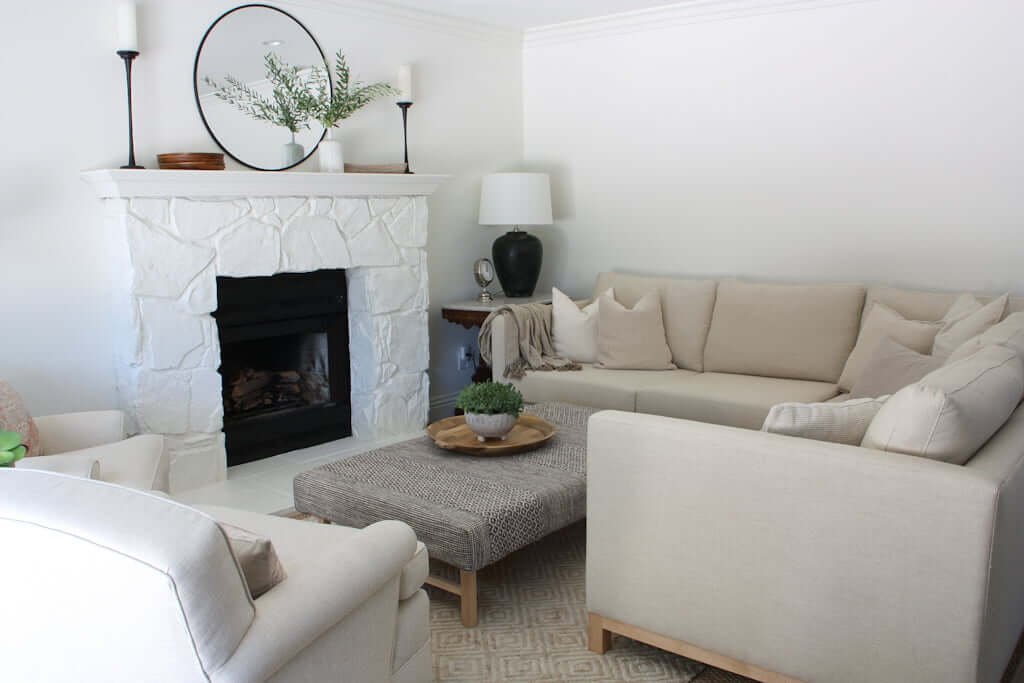
However, take our living room with zero windows and only glass sliders to the backyard, and you get one of the darkest rooms in our house!
You’d better believe I was going with a white fireplace and light-colored elements in here!
Speaking of walls, you’ll want to read my own list of Wall Decor Ideas: The (Only) 10 Types You Actually Need to Know!
CHOOSING INTERIOR PAINT COLORS
#2: Look at your window treatments!
What kind of window treatments do you have in the space? Airy, sheer curtains or two sets of heavy, light-blocking fabric? Do you have Roman shades that stay up out of the way of the windows or do you have plantation shutters (which lower the amount of light coming in)?
When we first moved into our house, there were zero window treatments. It was the middle of winter and got dark very early. We soon realized we needed something to cover our windows, and after several weeks of trying makeshift, temporary curtains (and even garbage bags to keep the light out in our bedrooms), we realized we needed to get something better.
We also had a 5-month-old baby who was taking multiple naps a day. Sleep-deprived and living through ripping out our new kitchen, we called in some companies to give us quotes on plantation shutters. We’d never had them before but thought they seemed easy and functional.
While we do like a lot of the function of them, we didn’t realize how much light they would block. Perhaps in a different house they don’t make much of a difference, but in our low-ceilinged, low-windowed house, we’ve now realized we need every inch of natural light from our windows that we can get!
CHOOSING INTERIOR PAINT COLORS
#1: Look at your natural light—AND take it up a level!
It’s easy to just focus on the number and size of your windows as the way to determine “how much natural light” a room gets. And that’s a good start!
But I challenge you to step it up a level and look at the
time of day you get that natural light!
For example, the whole back side of our house (which includes our living room, kitchen, dining room, and family room!) gets only a bit of late morning light. Early morning, the sun is blocked by our gorgeous big backyard trees, and after noon…forgetaboutit. The sun has moved towards the south side of the house which has zero windows into this main portion of our house!
It would be very different if our house was facing in a different direction (or if it had windows in different walls). But those are things we reeeeeeally can’t change, ya know?
7 STRATEGIES FOR CHOOSING INTERIOR PAINT COLORS
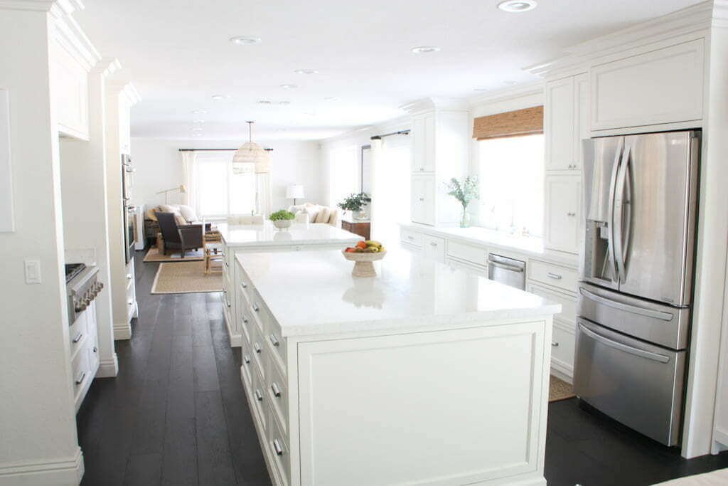
Room Example: Our Kitchen!
So, let’s take the kitchen as an example. Here’s what we’re working with:
- Low ceilings.
- Dark floors.
- One window.
- A couple hours of sunlight per day.
- Opens into one of the darkest rooms of the house with the least natural light.
Hmmmmm…what color kitchen should we choose?!?
“What to choose? What to choose?” (We’re soulmates if you heard that in Phoebe’s voice.)
If you’re excitedly saying “WHITE!” then yes, we’re on the same wavelength, my friend.
Before:
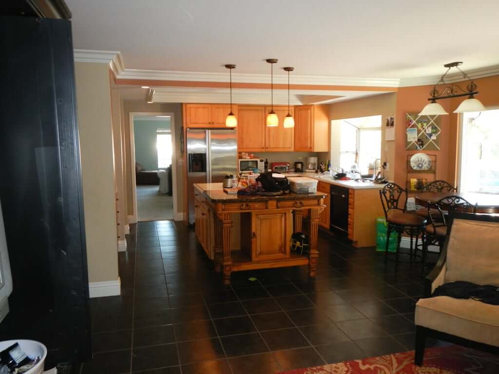
After:

Yes, yes, I know there are some who will disagree. (Even though we think the actual Before & Afters speak for themselves!)
But then it gets back to
what’s the look & feel you want in your kitchen?
Forget about everyone else. What do you want?
Us? We wanted light and bright! We wanted it to feel cheerful and open! We wanted as much natural light as possible to bounce around that kitchen and so we went with a white (Benjamin Moore Swiss Coffee, to be exact)…
…and we have NEVER doubted that choice for a moment! Even though it may not be our “Dream House Choice,” it IS the choice that
makes this house as much of a “Dream House” as it can be! 😉
CHOOSING INTERIOR PAINT COLORS
Work with what you’ve got!
Work with what you have, people! We’re not all building our dream homes from scratch, or buying someone else’s home who was smart enough to give it soaring ceilings and tons of windows all facing in the perfect direction for maximum light at optimal times.
Many of us are working with older homes, and we’re working with what we’ve got!
Next…
HUGELY connected to this color subject is what you hang on your walls! So I recommend you go to THIS one next (my 50+ Unique Wall Art Ideas By Room)…and yes, it has instantly shoppable links I hand-selected for you! 😘
To see more examples of rooms where we intentionally chose paint colors to create the look & feel we wanted, see our
PS: To view our home room-by-room, click HERE!
PPS: If you’d like our help on your own home be sure to check out our Design Guides & Plans or book a Design Consultation with us!


Would that Swiss white be a good color to paint the exterior of the house? If so, would be it too much to paint the interior and exterior the same color white? If no, what is your favorite white for exterior?
So thankful I found your blog!!! 😍 Your kitchen is gorgeous…and so are all your rooms and ideas.
Thanks Elizabeth! Happy to hear you’re enjoying our work.
Yes, Swiss Coffee can be used on an exterior. Whether a certain white is “too much” for exterior, interior, or both is dependent on the size of the house, the number of stories, trim, doors and window sizes, percentage taken up, type of siding or materials on exterior…plus interior…I could go on and on with the different factors we take into account before saying “Yes, 100% absolutely you should do this white here.” 😉
I have a quick phone consult option HERE to discuss your project for at least an hour. Not a full-scale in-depth client consult but just for those who need fast help 1:1, personalized for you. (Note: They’re often sold out; we just recently opened up a couple spots for this month and it will go back to Sold Out when those spots are gone.)
Jess
What a beautiful kitchen. Did you use Swiss Coffee on all your walls, base and ceiling?
PS, I’m so glad I stumbled on your blog. It has been so helpful!!
Hi Christi!
Thank you. Yes, we used Swiss Coffee in a variety of sheens.
We’re so glad you’ve found the blog helpful. Make sure you join our Insider’s List (free!) so you don’t lose touch with all the new things coming! 😉 https://thebrainandthebrawn.com/email-signup
Cheers,
Jess
Thanks too much for sharing this good post.
You’re very welcome.
Can you tell me what paint exactly you used for the ceilings? LOVE your house!
Pingback: My Favorite Paint Colors (Sherwin Williams) in my Home
I would literally lose my mind in a white house or a white room. Seriously, white makes me very uncomfortable. I’m that strange person who wants all the colours. I don’t even like white ceilings.
Looks beautiful! I have bright white cabinets and dark floors that look like yours and would love to replicate this look. Did you paint walls trim and ceiling and cabinets with Swiss coffee or are the cabinets more of a bright white?
Thanks Dee! 🙂 Our cabinets are Swiss Coffee!
– Jess
There are so many whites. Which are your favorites for rooms with little light?
Hi Diane! The quickest answer is to tell you “Swiss Coffee by Benjamin Moore!” We’ve done it in different houses and it’s been perfect in all varieties of situations with different amounts of light, ceiling height, floors, etc. But ALL white paints change color throughout the day and changing light. Honestly, sometimes I think designers can overthink white paint. 🙂 You can waste SO much time analyzing and comparing them during a project, time that could often be better spent elsewhere. That’s why my easiest, best quick answer is to say “Go Swiss Coffee!”
You are wise and I love how you went into detail about your decision making process. Also, can I just tell you how refreshing it is to see someone who digs deeper into making a decision. Not everyone on the design world does this and it’s so refreshing! Great post!
You are the sweetest, Halley, thank you! I definitely like to go into detail and dig deep and happy to hear you found it refreshing. 😉