With the front yard taken care of, we moved on to the exterior paint colors decision.
It wasn’t a dire need (like the new roof or the insulation or the completely new HVAC system we had to put into this fixer upper before moving in, among other things!), but it soon moved its way to the top of the priority list.
Not only had the stucco not been painted in 30 years, but much of the wood needed to be repainted anyway. So we figured, why not freshen up the colors while we’re at it?
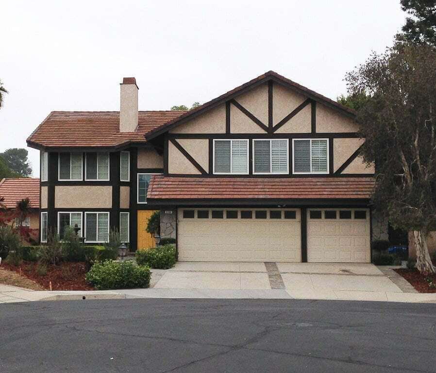
We were thinking something a bit lighter and brighter. Something to set this neglected old house apart from all the similarly-painted-dark houses in the area. Something friendly and fresh and welcoming every time we came home.
#1: We started by looking at what we couldn’t change about our exterior.
Like we did in our front yard landscape renovation, we started by looking at what we absolutely couldn’t afford to change at the moment. Such as
- The roof color.
- The windows.
- The stone veneer (to the sides of the garage).
As amazing as a full exterior makeover would be to do (and trust me, I’ve dreamed several up!), that pricetag is $$$kidscan’tgotocollege$$$.
There are things that—whether we like it or not—we gotta work with. And as they say, “Keep your friends close; keep your enemies closer.”
(Not that the roof color and windows are our enemies, but…you know.)
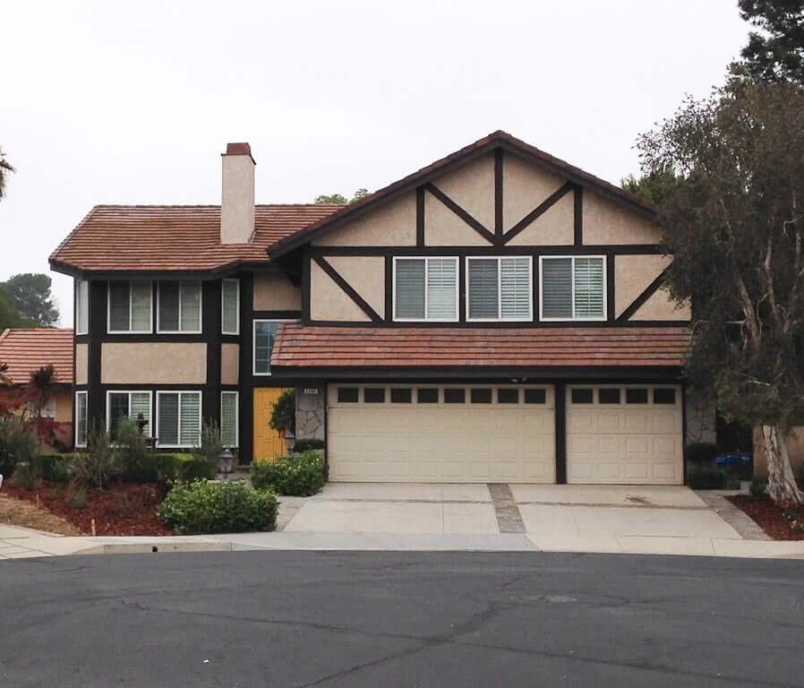
#2: We chose a starting point from the above list.
We decided to focus on the windows as our exterior color starting point.
Why? They’re white vinyl windows. They’re not beautiful, antique, all-wood, old-world-style windows. They are white vinyl, and that’s that for now.
So what did we see as the #1 mistake we could make about these windows?
#1 MISTAKE IN OUR MINDS:
Choosing colors that highlighted the vinyl-ness of those windows.
Therefore, white trim around the windows was the right answer for us. It would give a little more of the illusion that the wood trim (which IS real wood!) somehow meshed magically into the white “trimmed” windows and make them look less vinyl-y.
I’m not saying it makes them look like stunning antique windows by any means. I’m saying it minimizes the fact that they are not.
- It doesn’t draw your eye to them.
- Your eyes are free to focus in on other aspects of the house.
#3: We went from there to choose the right exterior paint colors.
Now we had our first decision under our belts, which was that the trim around the windows needed to be white.
We then knew we needed a contrasting color for the stucco (because our house design’s half-timbering has trim crossing over the stucco).
Many of the houses in our neighborhood are beige colors, and while I didn’t want to go completely grey, I knew I wanted to go grey-er than the rest of the homes around us.
The perfect amount of warmth and the perfect amount of coolness. Just like us, right? (I’m so glad I make myself laugh.)
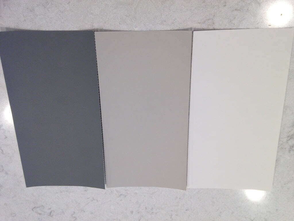
Plus, considering our super-warm roof color (another thing on our list we couldn’t change), it would be nice to cool it down with some grey tones.
#4: For garage doors, we took a few walks first.
I’ve lived in places where garage doors weren’t seen from the front of the house. I’ve also lived in places where garage doors are front-and-center.
If you’re in a neighborhood like we are, those house + garage styles will be unique. So there’s no one-size-fits-all here.
After perusing our surrounding neighborhoods on walks, we decided we liked a dark color. (It draws less attention to the garage door.)
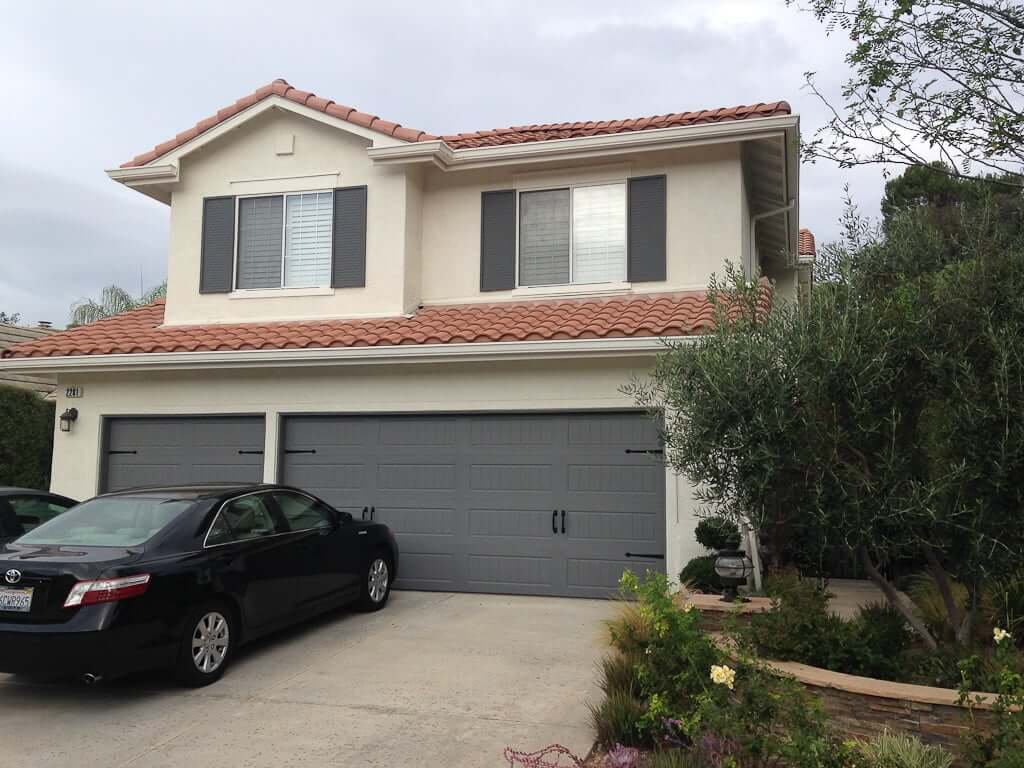
PS: I’m always surprised when I see clouds in one of our photos. This rarely happens here in California this time of year. I’ve been known to suddenly point them out to my kids, shouting, “Hey look, kids! A cloud! Don’t see many of those around here!” (This sounds like a joke but I’m serious. It’s happened. More than once.)
#5: We got mocked up photos of our favorite exterior paint colors.
After a bid process, we selected a paint company with great reviews. An extra bonus we found out was that they had a gal who would do mockups of the exterior paint colors for customers.
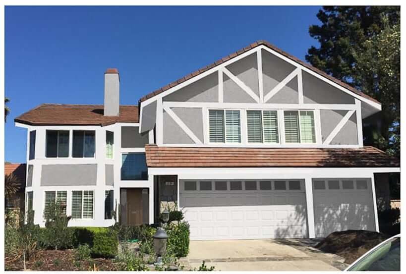
At the time, we were considering replacing the garage with a new wood garage door. (We eventually decided against it, but the mockup gal gave us two options showing that.)
Here you can see the comparison between more of a “straight grey” (Dunn Edwards “Gray Pearl”)…
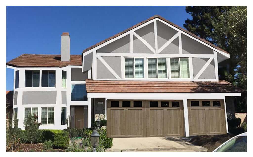
…and the warmer greige we had chosen (Dunn Edwards “Miner’s Dust”).
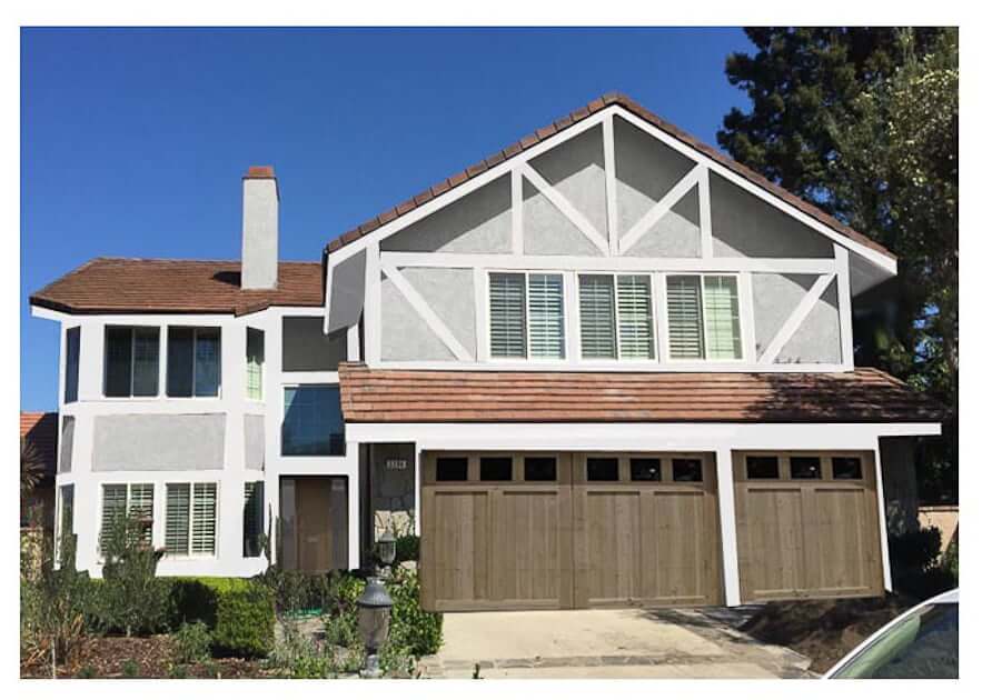
While I was 99% sure I wanted Miner’s Dust (the warmer grey), I was quickly aware from the above pics that this gal wasn’t too exact about her mockup colors, so I physically took myself into a Dunn Edwards location to talk to their expert color advisor.
#6: We get a second opinion…
Like I’d advise anyone in medical situations, get a second opinion when it comes to painting your entire house’s exterior. It’s a big decision, man! Finding the right exterior paint colors is important.
The DE color advisor agreed with me on going Miner’s Dust. (And even recommended I drive past a nearby house she was convinced was Miner’s Dust. Now THAT’S what I call a woman who has paint colors on the brain! Even while she’s driving! Fantastic!)
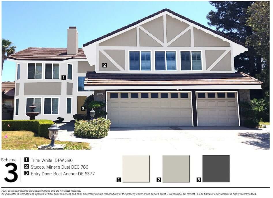
#7: …but I still listen to my gut.
This color consultant did bring up the idea of changing our exterior trim color. While she agreed on painting white around the windows, she really pushed painting the trim along the roof a dark color. She’d had another client do it, and she liked it.
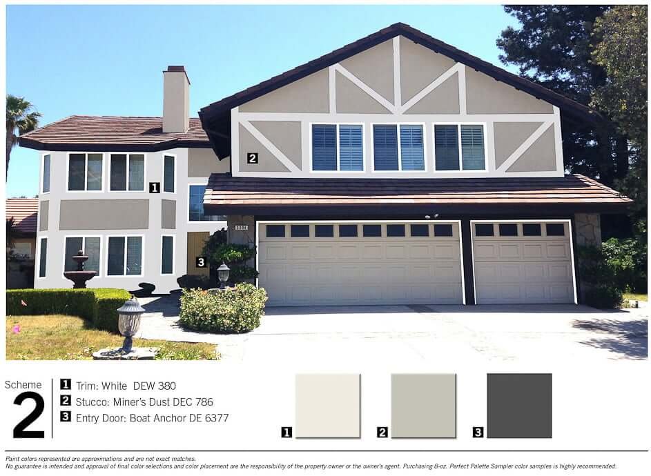
While I appreciated her expert opinion, and considered it, that just did not sit well with me. I understood it would make the trim “disappear”; I just didn’t understand WHY I would want to make our trim disappear. It’s a house! It has wood trim! We wouldn’t be foolin’ anyone!
➥ TIP FOR CHOOSING EXTERIOR PAINT COLORS:
Listen to your gut! I find that even if I can’t explain why I think X color looks better than Y, I should go with it. As Matt tells me, “Your gut is always right.“
Listening to others’ opinions is not the problem; it can be wise to listen. And sometimes I see the wisdom in the other perspective and it helps guide my decision. But it’s when I follow other people’s opinions while IGNORING my gut that I regret it later.
Get your gut on board no matter what! (Anyone else seeing a funny mental picture?)
Also, I felt it was too busy introducing a fourth color.
It’s kinda like pizzas.
A successful pizza restaurateur once said you shouldn’t have more than three toppings on a pizza. He said otherwise it gets too busy with flavors, and I completely agree.
You see how this relates to house colors, right?
Simple is best. And three is a nice number. Anything over that starts to get a bit busy.
So three exterior paint colors—trim, stucco, and garage/front door—was enough.
#8: We tested exterior paint colors on the house.
We painted a less conspicuous area alongside the stone veneer to see how our chosen stucco color would look against the stone. (See #1 of “Things You Cannot Change.”)
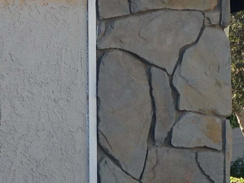
It looked good against the stone, so we proceeded to test.
We then tested three different exterior paint colors on our back patio’s pergola to see if we wanted to go white, medium grey, or dark grey.
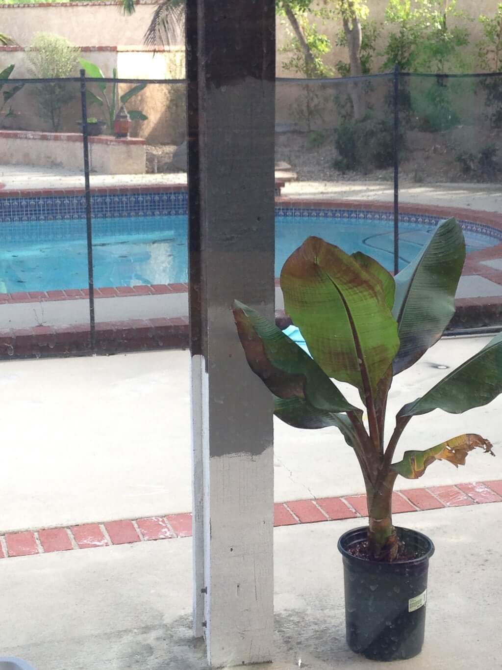
(And yes, you can see The Plant Lady is also “testing” some plant placements. These Abyssinian banana plants are one of my absolute favorites. The leaves and colors are just so unique and gorgeous when they’re mature!)
We get that white pergolas are beautiful. However, we’ve seen too many white ones here in California that look dirty and dingy after just a few months.
We didn’t want a dingy-looking pergola, so we liked the idea of going dark on that. We chose the darkest grey you see at the top.
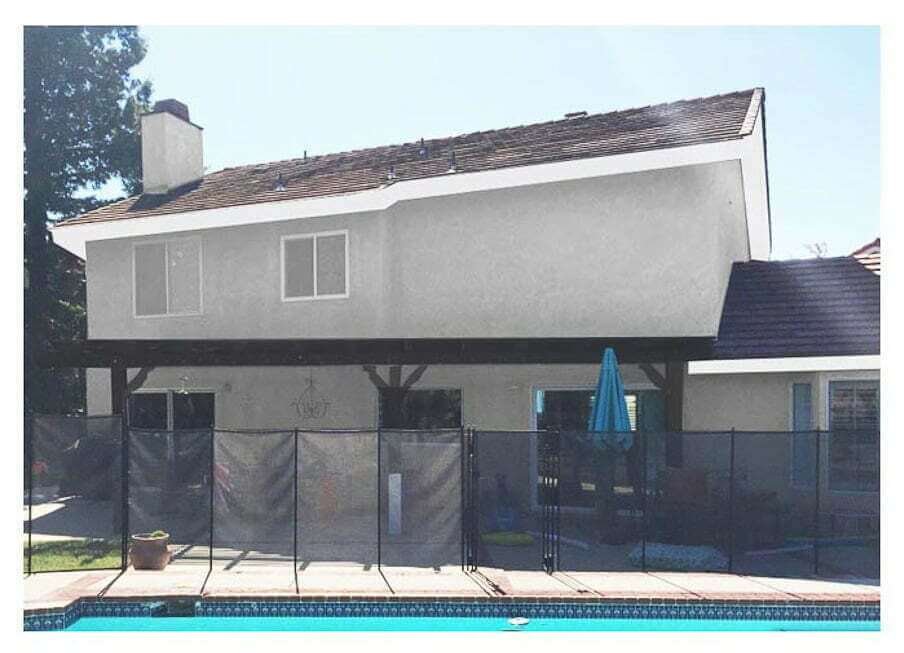
Plus, we liked the sharp contrast it had against the rest of the house in the mockup:
#9: We pulled the trigger!
We made The Call. Decisions are in. No turning back now. It’s painting time!
Update: See the final exterior paint colors completed in real life!
Check out all our projects & room updates in our current fixer upper house.?

